Brief for the Design of the Map
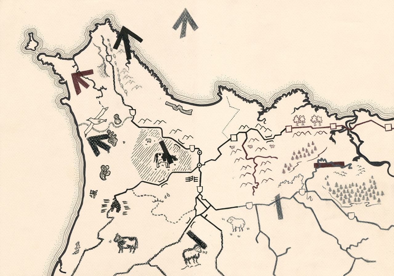
The instruction for the design of this map was for it to be drawn like those in the ancient times with simplistic pictorials and icons representing forestation, rivers, lakes, areas of farming and routes of travel. As the map needed to look ancient, we chose a cream shade of pastel paper to match the look of rusted paper that ancient maps tend to have. We chose pastel paper for the sturdiness of the paper which allowed the map to be folded and used many times out in the weather elements without breaking down too quickly and the paper texture gave the subtle surface pattern we wanted. Shades of black and grey pastel, biro pen, ink pen, pencil and charcoal were used for the drawings in the map to make the map look neat, but also crude with the many types of drawing media.
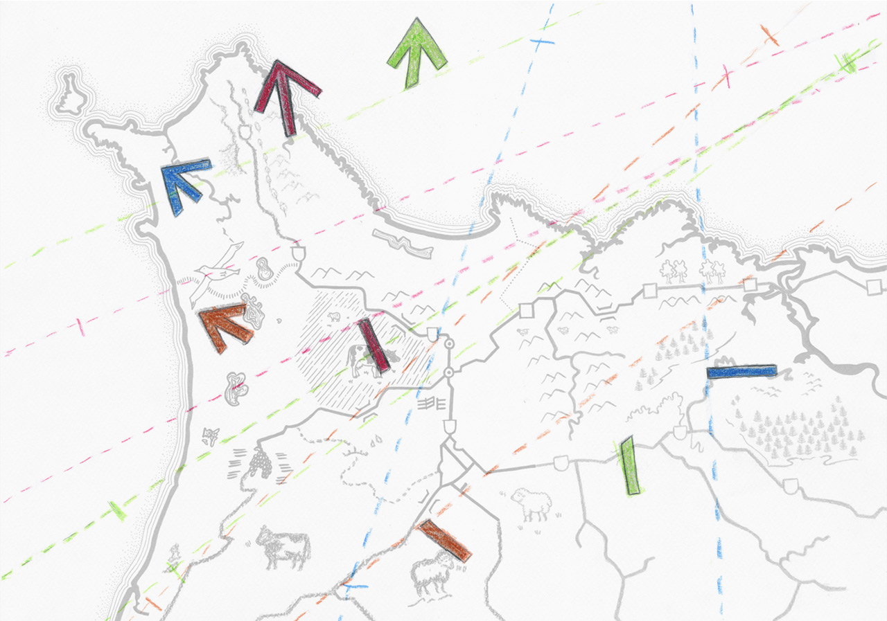
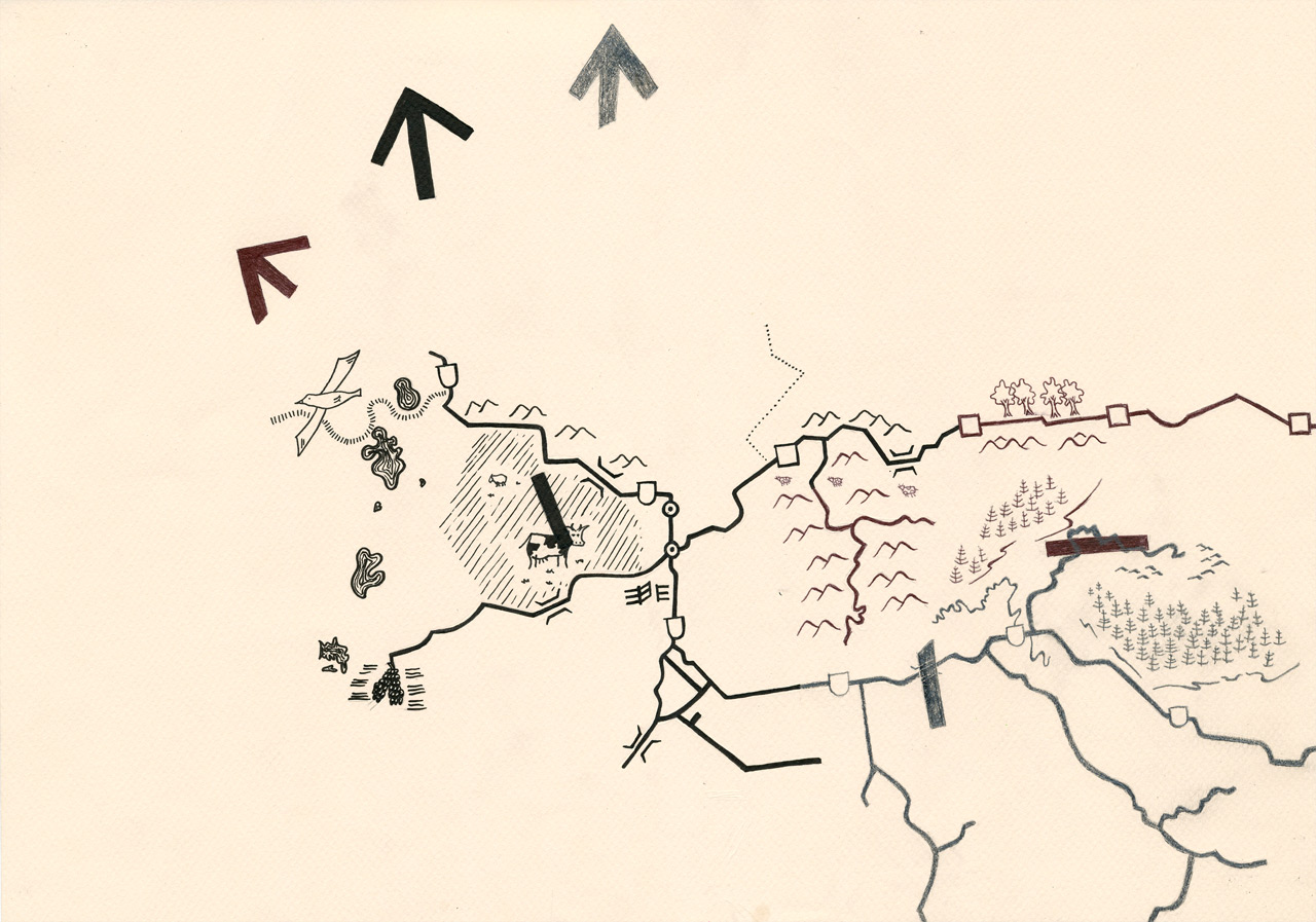
On this map, there are broken arrows. This map is to confuse the user, initially, then guide them up to the top-left corner by following the direction of the arrows. These broken arrow heads and tails are matched and joined through folding the map in a certain way. A drawing was created to show how the map is meant to be folded to join the arrows.
A ‘Magical Map’
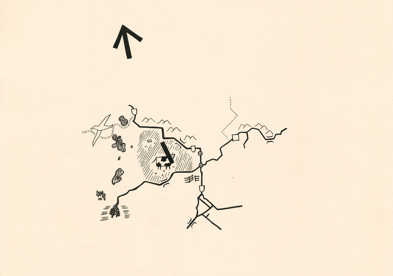
This map grows in detail as time goes by. Therefore, we had to create three maps that gave the illusion onscreen that it was transforming and growing into the final and complete map. The first one was designed to have only a quarter of the image of the final full map and each subsequent map was to show another quarter of the map. With each subsequent addition, pictorials and icons become more detailed and less crude.

Brief Information on the Short Film - A History of Map Making
This short film was going to be a part of the 2011 short film circuit. To date, there are no updates or news on the status of this short film.